George Moody of MIT-BIH noted back in 1996 that “neither first-order statistics nor frequency-domain analyses of HR (heart rate) time series reveal all of the information hidden in heart rate variations.” (Moody 1996) This post will evaluate that claim using a time series similarity metric contrasted with classical statistical tools on heart-rate data first made available at the website listed in the Works Cited section of this paper.
The Dynamic Time Warping algorithm (DTW) can detect similarities between time series missed by other statistical tests. It first became famous in the speech recognition community, because speakers with different cadences for the same sentences produced time series with temporal distortion relative to each other. (Senin 2009) In recent years, the DTW has been applied to electrocardiogram (ECG) data, including heart rate time series. (Raghavendra et al. 2011)
Comparing time series is nontrivial, because even those that are roughly equivalent may be phase shifted or otherwise distorted relative to each other. The following example is offered to help visualize phase shifting between periodic time series. Recall that cosine and sine are phase shifted versions of each other. When considered pairwise, samples of sine and cosine, sharing the same time step, will have different values with the exception of their intersections. Add 90 degrees to the argument of cosine, and these periodic time series will align perfectly, with both superimposed on the same sine graph.
The top graph of Itchy Sinusoids shows sine and cosine time series with 630 samples over the domain $[0, 2\pi]$. A random error term has been added to the range to make the sinusoidal graphs resemble other time series in terms of statistical noise. The bottom graph has the same cosine curve as the top, but the sine curve has only half the period of its blue counterpart. Will the DTW be able to recognize the sinusoids as belonging to the same family, despite the noise, phase shifts, and time distortions?
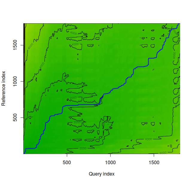
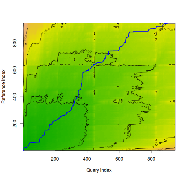
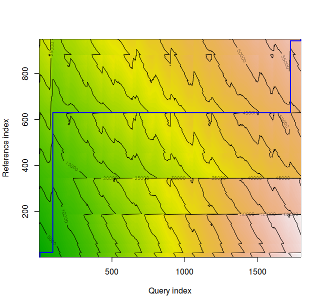
Note the time distortion evident from the flat line from approximately 0 to 100 on the Query Index axis, and the vertical line corresponding to 480 to 600 on the Reference Index axis. The entirety of the blue warping path flows through green pastures, meaning that the DTW has successfully identified sine and cosine as similar. The normalized distance between these graphs is approximately 0.138351, a number whose significance will soon become clear.
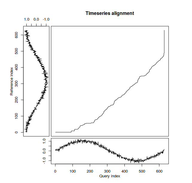
Contrast the prior plot with this Timeseries (sic) alignment graph. This diagram illustrates the mapping of one time series onto another more explicitly than the prior density plot, as the Itchy Sinusoids are displayed on their respective axes.
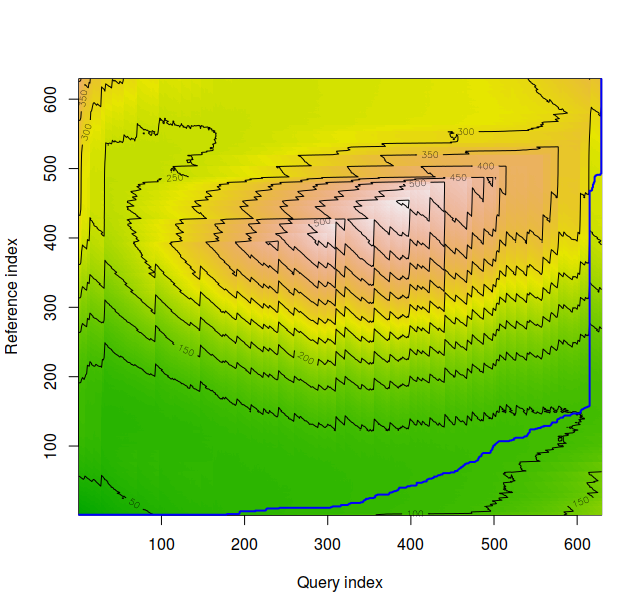
Note the time distortion from both the horizontal and the vertical portions of the plot. The DTW recognizes the two time series in the second graph of Itchy Sinusoids diagram are similar. The red and orange volcanic topography identifies regions where deviations from the blue warping path would be especially costly, indicating nonalignment of series in question if mapped through this region.
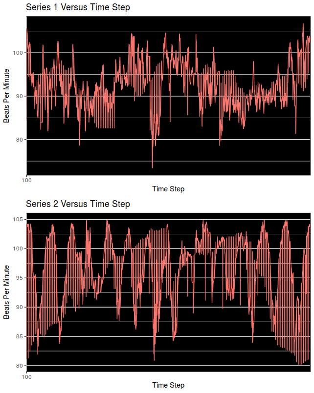
Individual Heart-Rate Time Series
We begin by inspecting the time series individually.
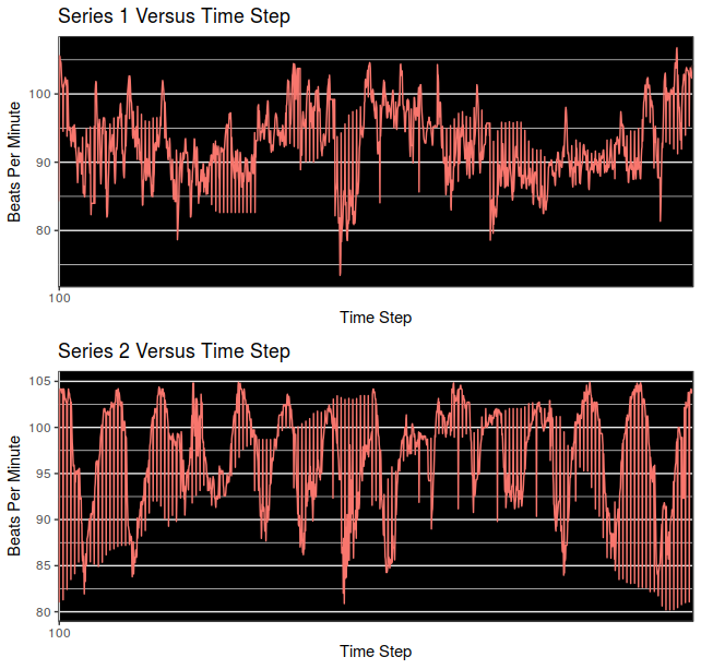
Time Series 1 and 2 appear above. They were found to have different means according to both the Student’s t-test and also the Wilcoxon Signed-Rank Test.
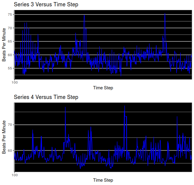
Time Series 3 and 4 appear above. They have the same means according to both the Student’s t-test and the Wilcoxon Signed-Rank test.
Plots Superimposed
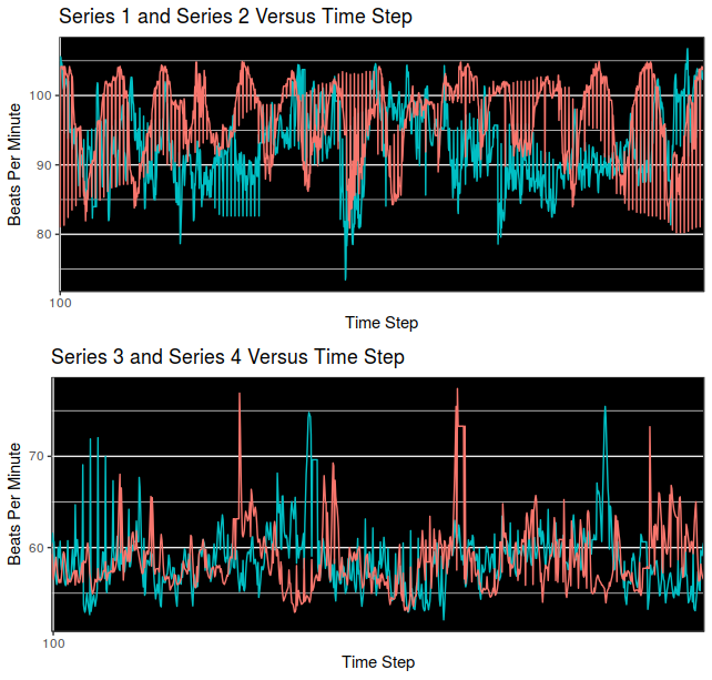
Superimposition of Series 2 on 1 (top) and 4 on 3 (bottom) appear above. These series have significant areas of overlap, and some differences as well. Can we quantify these similarities and differences?
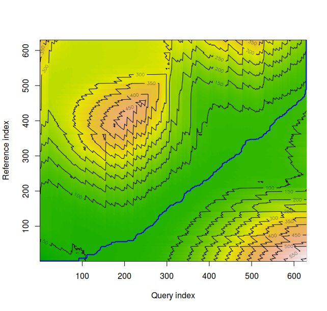
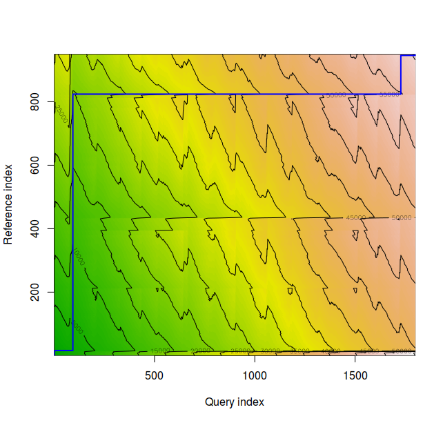
The density plot for time series 1 and 2 appear above. These appear to be very similar, and the normalized distance between the series is 1.150225.
The density plot for time series 3 and 4 appear above. These appear to be very similar, and the normalized distance between the series is 0.823477.
The density plot for time series 2 and 3 appear above. These appear to be very dissimilar, and the normalized distance between the series is 21.99057, almost 27 times the DTW normalized distance score of time series 3 and 4.
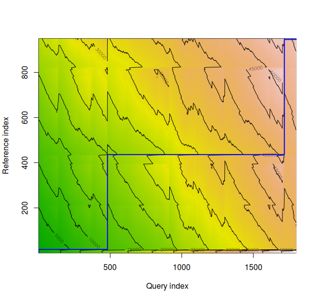
The density plot for time series 1 and 4 appear above. These appear to be very dissimilar, and the normalized distance between the series is 17.09765, almost 15 times that of Series 1 and 2.
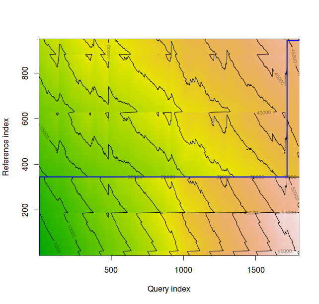
The density plot for time series 1 and 3 appears above. These appear to be very dissimilar, and the normalized distance between the series is 18.634422, over 16 times that of series 1 and 2.
The density plot for time series 2 and 4 appears above. Note the time warp. These appear to be very dissimilar, and the normalized distance between the series is 21.035185 over 25 times that of series 3 and 4.
Statistical Results
The means for Series 1 and Series 2 are 92.60074 beats per minute (BPM), and 96.64035 BPM, respectively and are not equal, according to the paired Student’s t-test (t = -21.842, df = 1798, p-value < 2.2 x $10^{-16}$). The means for Series 3 and 4 are 58.67132 BPM and 58.72698 BPM respectively and are not different at any standard statistical threshold according to the paired Student’s t-test (t = -0.33116, df = 948, p-value = 0.7406). Further t-tests revealed that no other time series pairs considered in the post were equivalent. Normalized distances between time series were very low for series 1 and 3, 2 and 4, and at least an order of magnitude higher for all other pairings as highlighted in the figures above.
Conclusion
The Dynamic Time Warping algorithm convincingly classified heart rate records for similar levels of exertion where the Student’s t-test was unable to do so. However, the DTW, unlike the Student’s t-test is not a hypothesis test, and the values it returns for normalized distance have not been compared to predetermined thresholds. Such thresholds need to be determined by the practitioner in the context of application. Nevertheless, the DTW can quantify information not included in low-order statistical parameters such as mean and standard deviation, and should therefore be considered as part of a feature selection toolbox for the predictive modeling of time series. George Moody was correct to claim the inadequacy of first order statistics for the abstraction of all relevant information from heart-rate time series.
Works Cited
Moody, George B. Heart Rate Time Series. 17 Oct. 1996, ecg.mit.edu/time-series/. Accessed 15 Mar. 2018.
Senin, Pavel. (2009). Dynamic Time Warping Algorithm Review.
S. Raghavendra, B & Bera, Deep & Bopardikar, Ajit & Narayanan, Rangavittal. (2011). Cardiac arrhytmia detection using dynamic time warping of ECG beats in e-healthcare systems. 1-6. 10.1109/WoWMoM.2011.5986196.
Packages Used
Erich Neuwirth (2014). RColorBrewer: ColorBrewer Palettes. R package version 1.1-2. https://CRAN.R-project.org/package=RColorBrewer
Claus O. Wilke (2017). cowplot: Streamlined Plot Theme and Plot Annotations for ‘ggplot2’. R package version 0.9.2. https://CRAN.R-project.org/package=cowplot
Giorgino T (2009). “Computing and Visualizing Dynamic Time Warping Alignments in R: The dtw Package.” Journal of Statistical Software, 31(7), pp. 1-24. <URL: http://www.jstatsoft.org/v31/i07/>.
Hadley Wickham (2007). Reshaping Data with the reshape Package. Journal of Statistical Software, 21(12), 1-20. URL http://www.jstatsoft.org/v21/i12/.
Hadley Wickham. ggplot2: Elegant Graphics for Data Analysis. Springer-Verlag New York, 2009.