The sum of random variables should not be confused with the sum of their distributions. If both distributions are normal, the former is also a normal distribution with appropriately scaled parameters. The latter would be what is called a Gaussian mixture. This piece will illustrate both sums, beginning with two normal distributions with identical standard deviations yet different means.
First, we load necessary packages and define our distributions:
pacman::p_load("ggplot2",
               "RColorBrewer",
               "extrafont")
set.seed(1234)

### Define standard-normal random variables
sample_size = 10^5
dist1 = rnorm(sample_size, mean = 50, sd = 5)
dist2 = rnorm(sample_size, mean = 65, sd = 5)
dist3 = dist1 + dist2 # arithemtic sum of random variables
Then, we graph dist1 and dist2 where both components are contained in the dataframe, df1:
### Separate distributions: designated by position = "identity"
df1 <- data.frame(flip = factor(rep(c("H", "T"), each = sample_size)), value = round(c(dist1, dist2)))

ind_dist <- ggplot(df1, aes(x = value, color = flip, fill = flip)) +
  geom_histogram(aes(y = ..density..), position = "identity", alpha = 0.8, binwidth = 1) +
  scale_color_manual(values = c("#000000", "#000000", "#999999")) +
  scale_fill_manual(values = c("#2C3E50", "#0CB1B9", "#000000")) +
  labs(title = "Individual Distributions", x = "", y = "") +
  theme_bw() +
  theme(plot.title = element_text(hjust = 0.5)) +
  theme(text=element_text(size=10, family="Montserrat")) +
  theme(legend.position = "none") +
  stat_function(fun = dnorm, args = list(mean = mean(dist1), sd = sd(dist1))) +
  stat_function(fun = dnorm, args = list(mean = mean(dist2), sd = sd(dist2)))

ind_dist
The result is the following figure:
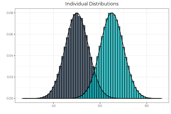 Fig. 1: Two normal distributions, with different means and the same standard deviations. Note the the overlap between the two. This overlap is dealt with in Fig. 3. The next figure illustrates the summation of random variables.
Next, we graph the sum of the random variables, designated in the first code block as dist3:
### Summation of Random Variables with color interpolation
df2 <- data.frame(flip = factor(rep(c("HT"), 2*sample_size)), value = round(c(dist3)))
blend <- colorRampPalette(c("#2C3E50", "#0CB1B9"), interpolate = "spline")

arithmetic_sum <- ggplot(df2, aes(x = value, color = flip, fill = flip)) +
  geom_histogram(aes(y = ..density..), position = "stack", alpha = 0.8, binwidth = 1) +
  scale_color_manual(values = c("#000000", "#000000", "#999999")) +
  scale_fill_manual(values = blend(17)[[7]]) +
  labs(title = "Arithmetic Sum of Random Variables", x = "", y = "") +
  theme_bw() +
  theme(plot.title = element_text(hjust = 0.5)) +
  theme(text=element_text(size = 10, family = "Montserrat")) +
  theme(legend.position = "none") +
  stat_function(fun = dnorm, args = list(mean = mean(df2$value), sd = sd(df2$value)))

arithmetic_sum
The result is as follows:
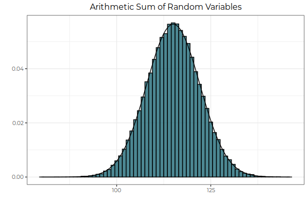 Fig. 2: The arithmetic sum of two random variables is itself normally distributed. Here, we sum the values of each random variable, drawn from its respective probability distribution, and then take the frequency of observations, bin by bin. In other words, in the context of this graph, we sum horizontally, adding the x-axis components of the two distributions together.
In both figures 1 and 2, the equations for the normal curve were added using R’s dnorm function. This time, however, we want to graph the equation of our Gaussian mixture, which requires the writing of a custom analogue to dnorm as the sum of two normal probability-density functions:
### custom function returning dnorm equivalent of Gaussian Mixture
gaussian_mixture <- function(x, mean1, mean2, sd1, sd2){
  coeff1 = 1/sqrt(2*pi * sd1^2)
  coeff2 = 1/sqrt(2*pi * sd2^2)
  freq = coeff1 * exp( -((x - mean1)^2) / (2*sd1^2)) + coeff2 * exp(-(x - mean2)^2 / (2*sd2^2))
  return(freq)
}

### Add the distributions as opposed to adding the random variables
gauss_mix <- ggplot(df1, aes(x = value, color = flip, fill = flip)) +
  geom_histogram(aes(y = ..density..), position = "stack", alpha = 0.8, binwidth = 1) +
  scale_color_manual(values = c("#000000", "#000000", "#999999")) +
  scale_fill_manual(values = c("#2C3E50", "#0CB1B9", "#000000")) +
  labs(title = "Gaussian Mixture: Sum of Distributions", x = "", y = "") +
  theme_bw() +
  theme(plot.title = element_text(hjust = 0.5)) +
  theme(legend.position = "none") +
  theme(text = element_text(size = 10, family = "Montserrat")) +
  stat_function(fun = gaussian_mixture, args = list(mean1 = mean(dist1),
                                                    sd1 = sd(dist1),
                                                    mean2 = mean(dist2),
                                                    sd2 = sd(dist2)))
gauss_mix
The customized function, entitled gaussian_mixture, is superimposed as follows:
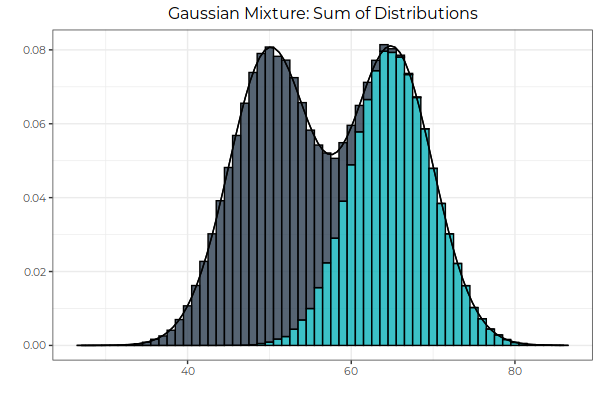 Fig 3: The sum of normal distributions is bimodal. Here, we sum the frequencies of the the probability distributions, leaving the underlying values of each random variable untouched. The result can be thought of as a stacked bar graph whenever the overlap of the distributions is significant enough to be visible.
Conclusion
Since fitting a unimodal distribution to a multimodal one would result in a poor fit, it is important to be able to deal constructively with Gaussian mixtures. Ordinary Least Squares (OLS) regression runs on assumptions of normality, not multimodality. It is therefore important, when faced with a Gaussian mixture, to be able to efficiently decompose the distribution into its component univariate distributions. In the next post, we begin with the algorithmic decomposition of a given multimodal distribution into its Gaussian components. Once the theoretical framework has been built, we will study applications.
Packages Used
Carson Sievert (2018) plotly for R. https://plotly-r.com
Erich Neuwirth (2014). RColorBrewer: ColorBrewer Palettes. R package version 1.1-2. https://CRAN.R-project.org/package=RColorBrewer
H. Wickham. ggplot2: Elegant Graphics for Data Analysis. Springer-Verlag New York, 2016.