Increasing longevity across age groups is one of the greatest triumphs of both public health and medicine, pandemics notwithstanding. People of every age, from neonates to supercentenarians, are living longer than they used to. Put differently, per 100,000 lives, there are more people of every age alive today than there were in 1941 and in almost every intervening year.
The following public health improvements and medical interventions are largely responsible for this good news:
- Vaccinations against polio, measles, mumps, rubella, and smallpox have saved countless lives
- Antibiotics and antimicrobial agents such as penicillin became widely available in the late 1940s
- Clean water supply and sewage treatment systems have reduced transmission of waterborne diseases
- Chronic disease prevention and management in areas such as cardiovascular disease, cancer, diabetes, and respiratory illnesses, have reduced mortality and morbidity
- Advances in obstetrics, neonatal care, and pediatric medicine have led to substantial improvements in mother-infant mortality
- Public health policy such as food safety regulations, workplace safety standards, tobacco control laws, and reduction of air and water pollution have enhanced environmental safety
- Advancements in medical technology, such as diagnostic tools, imaging techniques, and telemedicine, have improved healthcare delivery and patient outcomes
- Technological progress has facilitated the data collection, analysis, and drug discovery that fights pandemics and affords HIV positive patients the opportunity to live into old age
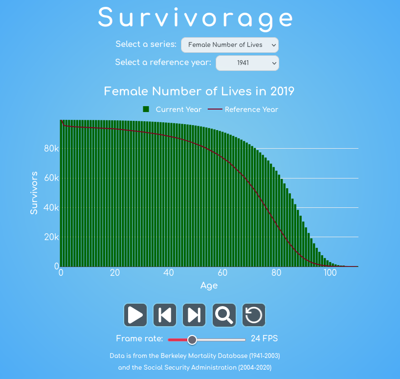
To view the impacts of these polices over time, head over to Survivorage and press play. The red line and the green bar graph both begin in 1941. As the arrow of time flies forward through the advancements of yesteryear, the green bars climb beyond a static red boundary, illustrating incredible progress. Select different series to see how the probability of death has fallen over time, for all age groups or how life expectancy has increased. Change the frame rate slider on the bottom to control the rate of the animation, and if you’re feeling up to it, visit the good people at the Berkeley Mortality Database and the Social Security Administration. Their data, combined with algorithmic interpolation of annual intervals, facilitated this animation.
Your suvivorage may vary.